Starting a conversation about the referendum results with a little bit of data

On May 5, 2022, 59% of voters determined that Bristol would be returning to a committee system. The mayoral system that began in 2012 would end after two mayors and three terms of office.

The hows and whys of this change are yet to be explored in terms of geography in depth so, I’d like to start with a look at how voters made their choices around Bristol.
The council, unfortunately, does not provide ward-level data for how the electorate voted so we proceed at this point with some optimism rather than certainty about the quality of our data.
Electoral Services say they don’t need to keep ward level data about how people voted but I have been sent some data from a political party. It comes with warnings: It is not weighted and does not take account of postal votes.
How important are these factors? In 2012, there were over 26k postal votes so this isn’t a trivial amount but it’s the best we’ve got right now. We also don’t know that postal voters would have voted differently from the rest of their wards.
Let’s proceed with our uncertainty. We are not seeking absolutes here. I just want to explore what happened.
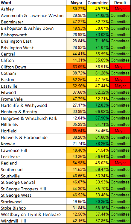
I have posted all the data I have at the bottom of this blog post but I’m starting with the extremes.
Out of 34 wards, six chose (in the data we have) to keep the mayoral model.

The two highest votes for the mayoral system were in Horfield with 65.5% and Clifton Down at 63%. This means that six out of ten voters in Horfield and Clifton Down were voting the keep the mayoral system.
In contrast, the wards with the highest percentage of votes for the committee system were the following:

At Hengrove and Whitchurch, only one in every ten voters chose to keep the mayoral system. In Knowle and Stockwood, it was two out of every ten, and in Bishopsworth, Brislington East & West, and Avonmouth & Lawrence Weston, only about three out of very ten voters wanted to keep the system we already had.
The rest voted for change.
The question now is why? Why such a variation in voting behaviour? What makes Horfield, in the north of Bristol, so interested in the status quo while voters in the south, in Hengrove and Whitchurch, wanted change?
Spatial analysis tests tell us there is a geographical element to these results. Areas that wanted to get rid of the mayoral system, are clustered together, as are areas that wanted to keep it.
But what are the underlying reasons? Hotwells and Harbourside (H&H) might have been swayed in their choices by the upcoming plans for the Western Harbour. You can see in the map below that the boot-shaped ward is a slightly darker colour than its neighbours.

In a sea of 49.9% to 56.6% ranges of votes for the committee system, 6 out of 10 H&H voters chose the committee system (62%).
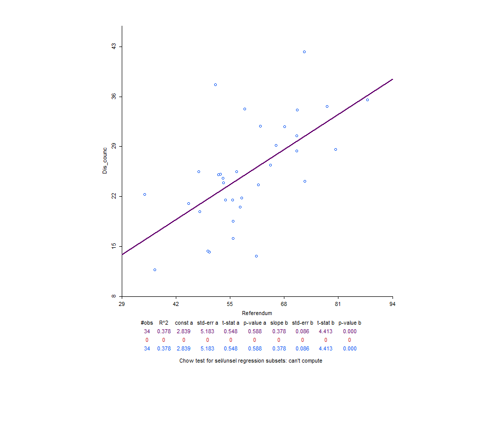
Without qualitative research and anecdotes other than my own, we can make a start with data available from the Quality of Life survey. The council pays £40k a year to run this survey and the methodology seem robust, in my assessment. Handily enough, the data is also available at ward level.
I chose three variables to begin the exploration of why wards voted for a committee system. I fit a regression analysis to see whether people’s opinions on the city had an effect on how they voted or whether it was random.
First, I wanted to see how much dissatisfaction with the council contributed to the result and whether it was a significant variable. The statistical analysis suggests increase in dissatisfaction with the council indicated an increase of votes for a committee system. But this accounted for only around 36% of the variation.
What if we take a look at the % of those in wards who were satisfied with the local bus service?

With buses, we can see that a lower satisfaction with bus services increases the vote for a committee system.

The third variable I chose was about climate change. It was worded as “% very concerned about climate change”. We can see that those most concerned were also less likely to vote for a committee system. This goes slightly against my initial ideas so I’ve included it.
If we add these three factors together in a multiple regression analysis we have an explanation (adjusted R square) for about 59% of the ward percentage votes.
What this data is suggesting is that by knowing how dissatisfied a ward is with the council, what the satisfaction is like with buses and what concerns are like over climate change, we can explain a fair amount of the voting results. All three variables are significant and dissatisfaction has a bigger effect than the other two.
There are many more variables to explore in the Quality of Life data. Feel free to send me your ideas and we can explore those too.
A point I will reemphasise here is that there is a geographical element to how people voted. We can see that there are very few areas that voted to keep the mayor, but what really stands out is that South Bristol were the most determined to get rid of him/the system.
I present this information to you as a conversation starter. We have the data and we have the people who can suggest to us why they voted. Let’s start figuring out what went wrong so we can make things better under the new system.
We can do this together.
Caveat: This data has its issues in terms of uncertainty but it’s useful and I’ve had some assurances that it is ‘close enough’ for the purposes of our conversation.